LLM-powered telemetry analytics from metrics to root causes and recommendations
February 26, 2026Modern IoT platforms are excellent at collecting and visualizing data: telemetry, device statuses, alerts, charts, and reports have long been the standard. In practice, however, users often need more than just numbers on a screen — they need to understand what those numbers actually mean.
This is where the gap between “having data” and “making decisions” appears:
an operator sees a spike in grid_power but doesn’t know whether it’s normal or a problem;
an engineer sees a fault_code but has to spend time gathering context;
a manager looks at an energy report but can’t quickly understand what changed compared to last week — and why.
In short, metrics show what is happening, but they don’t always explain why — or what to do next.
LLM-powered IoT analytics bridges this gap. It adds an interpretation layer on top of telemetry: helping detect anomalies, compare time periods, correlate signals, and explain what’s going on in plain language — without forcing users to manually piece together insights from dozens of charts and dashboards.
What LLM Analytics Adds on Top of Telemetry
In the IoT context, LLMs are neither a replacement for the platform nor “magic on top of charts.” They form a new analytical layer that helps users work with data faster and more meaningfully.
From Data Display to Data Interpretation
A traditional dashboard answers the question:
“What are the metric values?”
LLM-powered analytics addresses the next level of questions:
- “What is unusual here?”
- “What has changed compared to the previous period?”
- “Which events could have influenced this?”
- “How can this be explained to an operator or a manager?”
In other words, LLMs help turn raw metrics into a coherent narrative.
LLM as a Layer for Explanation, Comparison, and Root-Cause Discovery
When combined with telemetry and events, LLMs can:
- highlight deviations and anomalous segments;
- compare time periods and show what exactly has changed;
- correlate telemetry with alerts, device states, and commands;
- explain power flows (where energy is going and why);
- produce concise takeaways tailored to different roles: operators, engineers, and managers.
Importantly, the LLM is not “guessing” the answer. It operates on real platform data (via MCP tools): fetching telemetry, alerts, configuration, and command history — and building explanations on top of that factual foundation.
Why This Matters Especially for Operators and Engineers
In real-world operations, response time is critical. Issues rarely show up as a single obvious “red” signal. More often, they emerge as a chain of interconnected changes across the system, gradually building up into a visible problem.
LLM-powered analytics helps quickly assemble this chain into a single, coherent explanation. This is especially valuable in situations where teams need to act fast, rather than manually “reading” dozens of charts and timelines to reconstruct what actually happened.
Key LLM Analytics Scenarios (Using an Inverter Monitoring App as an Example)
Let’s use an inverter monitoring application as an example — whether for a single inverter or a fleet of inverters managed through a universal energy controller. Such an application typically includes telemetry, energy metrics, alerts, device states, fault codes, and event history.
This is an ideal environment for LLM-powered analytics: the data is rich, highly interconnected, and user questions are rarely about isolated metrics. More often, users need contextual answers — understanding what changed, what caused it, and what action should be taken next.
Plain-Language Anomaly Detection
One of the most common operational questions is: “What’s wrong here?”
Users don’t always know which metric to open or which threshold to check. What they need is a fast, clear answer in human terms.
LLM-powered analytics lets them ask questions in natural, task-oriented language:
- “What was unusual about inverter X over the last 24 hours?”
- “Find sharp drops or spikes in power and connectivity.”
- “Were there any anomalous periods in load or grid import?”
In response, the assistant can:
- scan telemetry time series for the selected period;
- highlight atypical segments (spikes, drops, instability, “sawtooth” patterns);
- point out which signals changed at the same time;
- explain what happened in plain language.
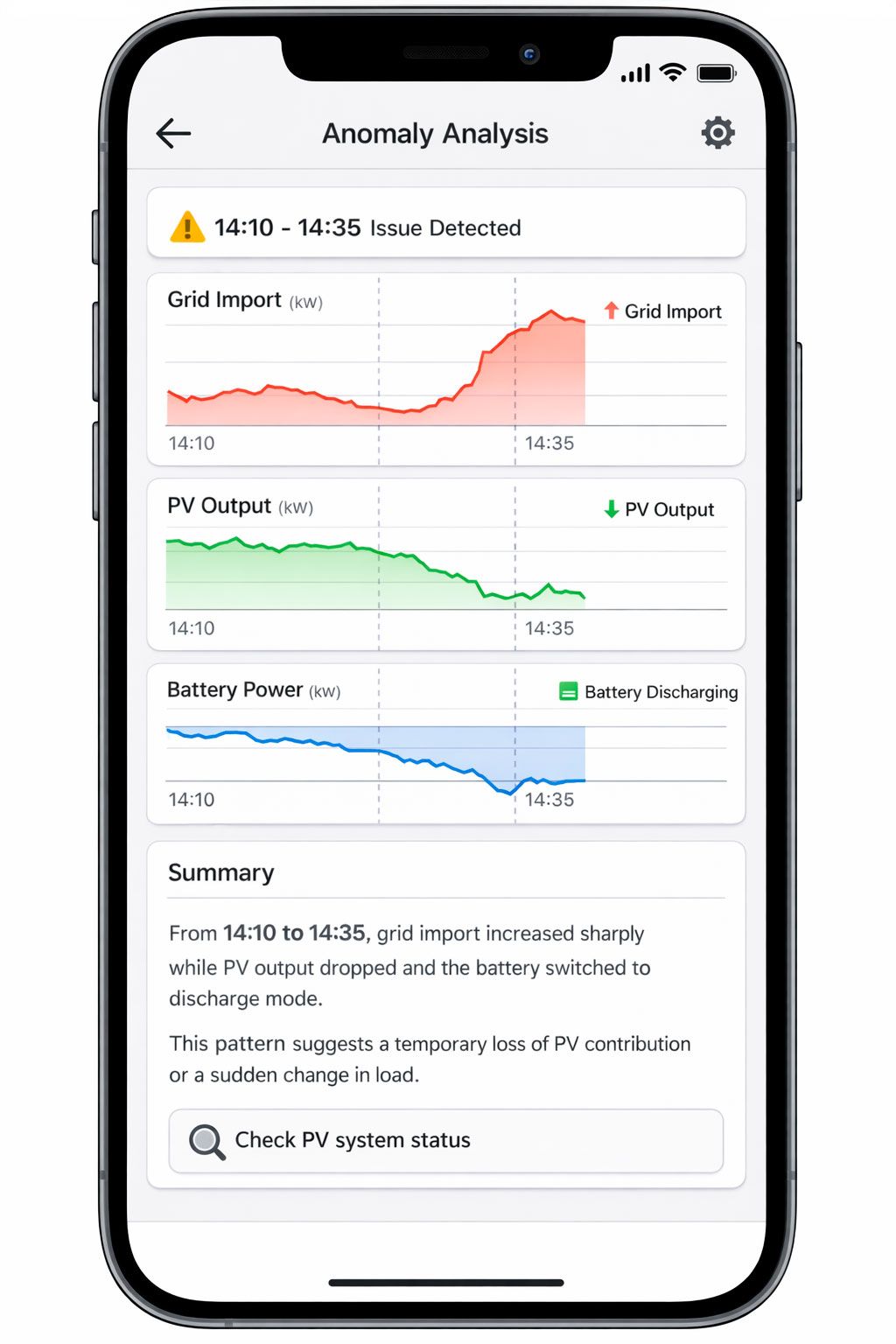
So instead of a dry “the value increased by 37%,” the user gets something like:
“From 14:10 to 14:35, grid import increased sharply while PV output dropped and the battery switched to discharge mode. This pattern suggests a temporary loss of PV contribution or a sudden change in load.”
This is especially valuable for operations teams: they don’t need academic analysis — they need a fast, understandable pointer on where to look next.
Finding Correlations Between Signals
The next level is not just noticing an anomaly, but understanding what it is related to. In IoT and energy systems, data rarely exists in isolation: a change in one metric almost always affects others.
In an inverter monitoring application, typical relationships look like this:
- grid_power_total ↔ PV power ↔ battery_power
- device_state ↔ fault_code / warning_code
- offline intervals ↔ Wi-Fi RSSI ↔ Modbus error counters
- alerts ↔ neighboring telemetry before and after the event
LLM-powered analytics makes it possible to ask these questions directly:
- “Does the increase in Modbus errors coincide with offline intervals?”
- “Is there a relationship between drops in PV output and increased grid import?”
- “Which warning codes are most often followed by higher grid load?”
The assistant can align telemetry and events over time and produce an understandable result:
- which signals changed at the same time;
- during which intervals this occurred;
- how consistently the pattern repeats.
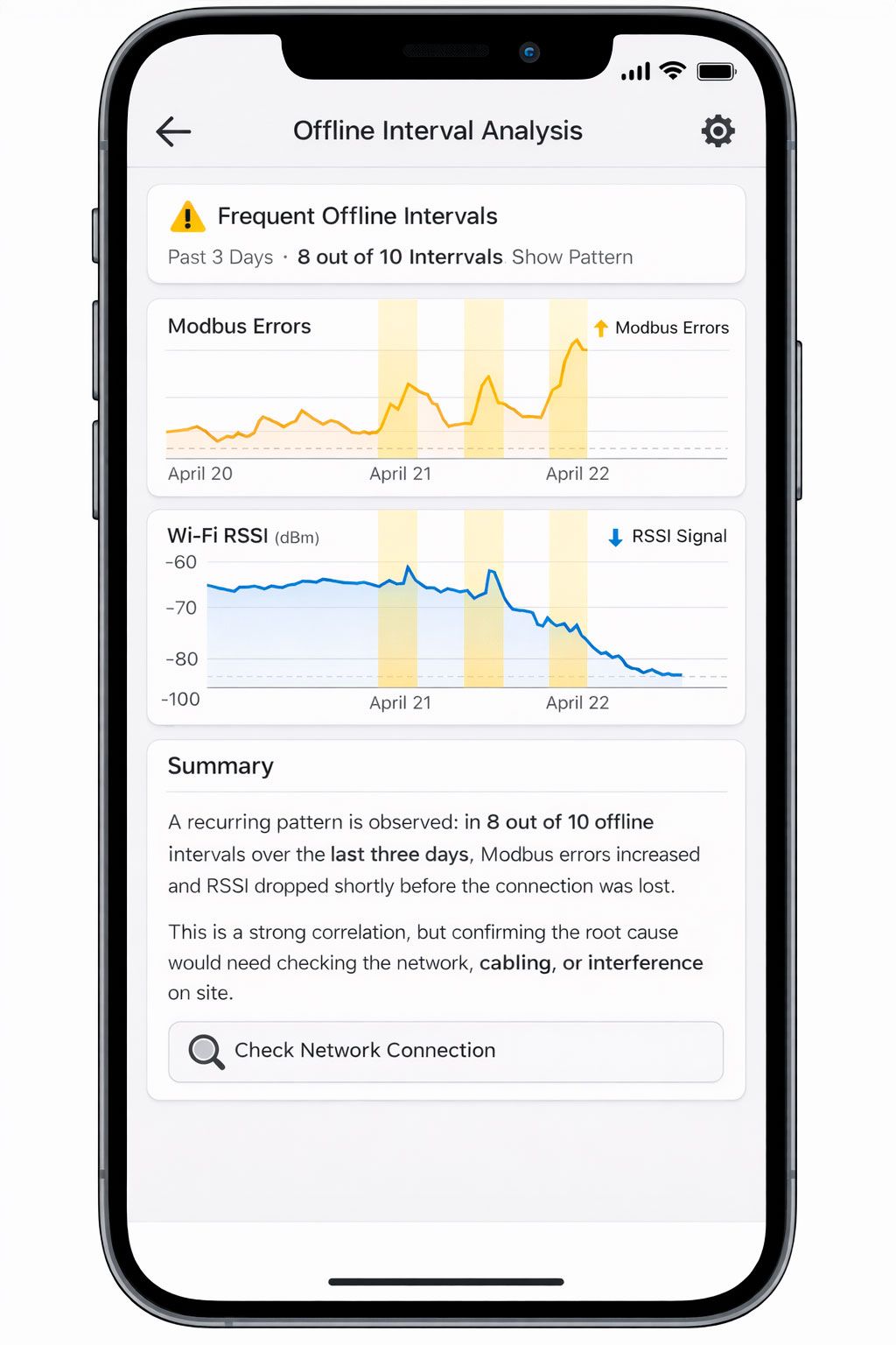
It’s important to present this correctly: correlation is not the same as causation. Good LLM analytics avoids making strong claims when the data is insufficient and instead uses careful language:
“A recurring pattern is observed: in 8 out of 10 offline intervals over the last three days, Modbus errors increased and RSSI dropped shortly before the connection was lost. This is a strong correlation, but confirming the root cause would require checking the network, cabling, or interference on site.”
This format is useful for both engineers and operators: it provides a working hypothesis rather than just “nice-looking statistics.”
The “What Changed?” Scenario: Comparing Two Periods
One of the most valuable scenarios for both business and operations is period-to-period comparison. This could be:
- today vs. yesterday,
- week over week,
- before vs. after an update,
- before vs. after an incident,
- before vs. after a device mode change.
Traditionally, this kind of analysis requires manually opening multiple charts, overlaying time ranges, and reviewing alerts and events. LLM-powered analytics compresses all of that into a single question:
- “What changed between this week and last week for inverter X?”
- “What changed after the mode switch command?”
- “Compare the day before the GRID_POWER_OFF incident and the day after.”
What the assistant does in this scenario:
- takes two time periods;
- compares key metrics (energy, power, alert frequency, device states);
- highlights the most significant deviations;
- checks whether there were nearby commands, alerts, or mode changes;
- produces a concise explanation.
Example output:
“Compared to last week, average grid import increased by 18%, PV contribution dropped by 12%, and the number of battery warnings rose from 3 to 11. The most noticeable deviations occurred on Tuesday and Wednesday between 16:00 and 20:00. This pattern coincides with reduced PV generation and the battery switching to a limited mode earlier in the day.”
The user gets more than just a “diff table” — they get an interpretation of what changed and where to look for an explanation.
Explaining Alert Causes and Incident Context
An alert on its own is just a signal. To understand what actually happened, you need context:
- what happened before the alert,
- what was happening during it,
- what changed afterward,
- whether there were related events or commands.
In a traditional UI, this usually means several manual steps: opening the alert list, selecting an event, opening neighboring telemetry, checking device states, and aligning time ranges.
LLM-powered analytics lets you request all of this as a single task:
- “Break down today’s GRID_POWER_OFF alert: what happened before, during, and after?”
- “Why did the longest incident over the last 24 hours occur?”
- “Create a short summary of critical alerts for the week.”
In this scenario, the assistant can:
- assemble an incident timeline;
- calculate duration and recurrence;
- pull key metrics from before and after the event;
- link the alert to device state, warning/fault codes, and commands;
- produce a concise incident summary.
Example output:
“Over the last 24 hours, three GRID_POWER_OFF incidents were recorded. The longest one lasted 27 minutes (13:42–14:09). About 10 minutes before the outage, grid_power_total dropped to zero and battery load increased, followed by a battery warning and discharge limitation. After grid power was restored, the device returned to normal operation within 4 minutes. The most likely cause is an external grid outage combined with battery constraints.”
For an operator, this is almost a ready-made report. For an engineer, it’s a starting point for investigation. For a manager, it’s a clear explanation without technical overload.
Why This Works Better Than Dashboards Alone
Dashboards are essential and will remain the foundation of visual monitoring. But they have a natural limitation: they show data, yet they don’t always explain relationships and changes.
LLM-powered analytics doesn’t replace charts — it makes them more understandable and more useful in day-to-day work.
Faster Diagnosis
Instead of clicking through multiple tabs, users can ask a single question and get a consolidated view:
- metrics,
- events,
- alerts,
- changes between periods,
- a concise explanation.
This is especially critical during incidents, when every minute matters.
Less Manual Analysis
Many tasks — comparing periods, finding anomalies, checking correlations — require manual work in a traditional UI. LLMs take over this routine and return a ready-to-use result.
A Shared Language for Different Roles
The same telemetry can be explained in different ways:
- as a technical breakdown for engineers,
- as an operational summary for NOC teams,
- as a business-level explanation for managers.
This reduces friction and “translation loss” between teams.
A More Natural Entry Point into Analytics
Not every user knows where to find the right metric or how to build the right filter. But almost anyone can ask a question in plain language:
- “What changed?”
- “Why did grid import increase?”
- “What was the context of this alert?”
This dramatically lowers the barrier to using analytics in everyday work.
Conclusion
LLM-powered telemetry analytics represents the next maturity layer for IoT platforms. It does not replace telemetry, alerts, or dashboards — instead, it turns them into a more understandable and decision-oriented toolset.
Using the inverter monitoring example, it becomes clear how LLMs help move from a mere “set of metrics” to answers to real operational questions. This is the core impact: users don’t just get data — they gain understanding, faster and more easily, in the format of a natural dialogue. Combined with MCP, this makes telemetry analytics not a separate “expert-only” activity, but a natural part of everyday work with IoT systems.

