Visualizing IoT architecture with diagrams
July 17, 2025It is quite complex to design and deploy an IoT system. It brings together a wide mix of components – sensors, devices, networks, gateways, servers, and end-user applications – all of which need to work in sync. That’s where IoT diagrams come in. They’re essential for making sense of the complexity because they visually convey system design to all stakeholders. These diagrams bring structure and clarity to complicated ecosystems, showing how sensors, networks, servers, and applications all work together. They are planning tools, communication bridges, and strategic assets.
Key layers of IoT architecture
First things first: IoT systems are typically built in layers, and diagrams help visualize how each layer fits into the bigger picture. Let’s take a closer look at an IoT architecture:
- Perception layer (Devices). This is where it all starts. Sensors, actuators, and other physical devices collect data – temperature, location, machine status, and more. Some of these devices also respond to commands, like turning off a valve or adjusting a thermostat. They rely on local controllers or microcontrollers to interact with the physical world.
- Network layer (Transport). This layer handles connectivity, using local protocols (Bluetooth, Zigbee), long-range wireless (LTE, 5G, LoRaWAN), or fixed networks (Ethernet, Wi-Fi). It’s the path that takes raw data from edge devices to gateways and onward to the cloud.
- Processing layer (Edge/Cloud). Here’s where the heavy lifting happens. Gateways, edge servers, and cloud platforms receive incoming data, filter out noise, and run analytics in real time. This layer powers automation and decision-making.
- Application layer. This is the user-facing part of the system. Dashboards, web apps, and mobile interfaces live here – tools that let people monitor devices, get alerts, and issue commands. Business logic in this layer triggers actions based on set rules.
- Business/analytics layer (Optional). Some architectures include a layer for mining insights from aggregated data. A simplified model may show: Perception → Network → Application → Business, with sensors feeding data to the cloud, then to analytics systems.
Diagrams make these relationships clear. They highlight communication flows, compute locations, and cross-cutting concerns like security zones or protocols. Teams use them to verify all necessary components – edge gateways, message brokers, dashboards – are accounted for. Technical diagrams may include labels like MQTT or REST, while executive views focus on business cases like “Smart Parking” or “Predictive Maintenance.”
Diagrams for planning, communication, and deployment
Diagrams drive the entire IoT project lifecycle. Let's see how they help in planning, communication and deployment stages.
Design and planning
In early stages, teams use diagrams to outline requirements:
- What types of sensors are needed?
- How will data travel through the system?
- Where are gateways or edge servers placed?
Instead of relying on long spec sheets, a diagram can show, for example, that a cellular gateway is needed to connect remote sensors to the cloud or that data from the floor passes through two edge hops to reach a cloud database.
Stakeholder communication
Diagrams bridge the gap between technical and non-technical teams. For example, a smart city diagram might illustrate how traffic cameras, pollution sensors, and smart streetlights feed into one analytics platform. It makes the system’s value – and any coverage gaps – instantly visible.
Deployment and operations
During rollout, diagrams act as blueprints. Field teams use them to install hardware in the right spots. Operations teams follow them to configure cloud resources. A deployment diagram might say, “Floor 3 sensors (blue) connect to Gateway A via Wi-Fi, which publishes to IoT Hub X.” They also help onboard new team members quickly.
You may be interested in: IoT communication models
Examples of IoT diagrams
Seeing how IoT works in theory is one thing, understanding how it comes together in the real world is another. That’s where architecture diagrams truly shine. They bring abstract systems to life, showing exactly how devices, networks, and platforms interact in specific environments. Below are two practical examples: smart cities and smart manufacturing.
Smart city: a unified urban system on one diagram
One of the most recognizable uses of IoT is in smart cities. Here, a well-structured diagram shows how thousands of devices across city departments feed into centralized systems. Picture this:
- Traffic sensors and cameras are linked to a central traffic management platform that monitors traffic flow and adjusts signals in real-time.
- Streetlight sensors connect to an energy dashboard, automatically dimming lights when roads are empty to conserve electricity.
- Air quality and flood monitors send live environmental data to a public safety center.
- Parking spot sensors communicate with apps to help drivers find available spaces.
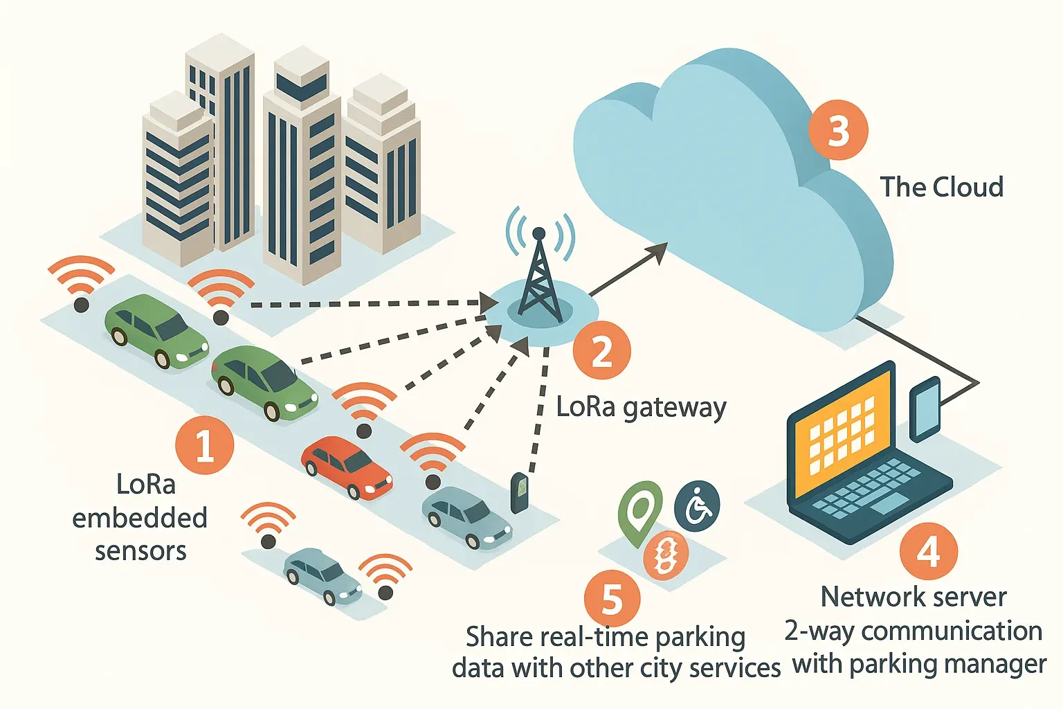
Even though each of these systems serves a different purpose and might be managed by different city departments – a single IoT diagram ties them together. It shows the shared infrastructure (like a LoRaWAN or cellular network), how data moves from sensors to dashboards, and where control systems make real-time decisions.
Smart manufacturing: visibility and control across the factory floor
In industrial automation, IoT diagrams offer much-needed structure to increasingly complex operations. A smart factory diagram might show:
- Robots and machines equipped with temperature, vibration, or position sensors.
- Edge servers or industrial PCs near each assembly line, collecting data from PLCs and local controllers.
- Cloud platforms connected via Wi-Fi, Ethernet, or 5G to analyze performance and trigger maintenance alerts.
These diagrams make roles and relationships explicit. For example, embedded “Edge Device” icons may sit on forklifts or conveyor systems, with arrows showing how data flows from these devices to the cloud – and how control flows back down. Engineers can then use these diagrams to plan wireless coverage, gateway placement, and failover scenarios.
How to make IoT diagrams actually useful: best practices that work
A diagram is only as good as its clarity. A confusing or outdated diagram can cause more harm than good. Here are a few field-tested practices that can turn your IoT architecture diagrams into powerful communication and planning tools:
- Label everything clearly. Don’t leave anything to guesswork. Arrows, lines, and nodes should always be labeled, whether it's a network protocol (like MQTT, HTTP, or LoRa), a data topic, or a device type. Instead of a generic “Sensor,” write “Zigbee Temp Sensor.” This helps any viewer, technical or not, immediately understand what’s connected, how, and why.
- Add a legend or key. If you're using color codes, icons, or line styles to differentiate between components (cloud vs. edge vs. device, or Factory A vs. Factory B), include a legend. For instance, you might use solid lines for wired connections and dashed ones for wireless, just make sure that’s clearly explained. A simple key can make the difference between instant clarity and total confusion.
- Stick to consistent icons and styles. Use a unified visual language. Whether you're drawing by hand or using a tool such as Lucidchart or Draw.io, choose standard symbols: open IoT icon sets, AWS/Azure diagram libraries, or UML/C4 models – and stick with them. And don’t rely on icons alone: always add a label so people know exactly what each element represents.
- Add a title and description. Every diagram should have a name and a short explanation. A title like “Edge Network for Smart HVAC System” immediately sets expectations. A brief caption beneath it, such as “This diagram shows sensor-to-cloud flow across three factory floors”, helps orient viewers before they dive in.
- Match the level of detail to the audience. You don’t need to show every wire and chipset unless you’re designing firmware. High-level overviews are ideal for executives or clients; deeper, technical diagrams are more suitable for developers and system integrators. If necessary, create a set: one diagram for each layer or function (overview, network topology, edge compute design, etc.).
- Track versions and updates. IoT systems evolve fast, so your diagrams should keep pace. Always include a version number or “last updated” date. Storing diagrams in shared repositories or version-controlled documentation ensures everyone’s working from the same source and builds confidence that what they see reflects the current system.
- Use the right tools. Lucidchart, Draw.io, and Figma are excellent for building and updating IoT diagrams. Choose tools based on your audience’s technical comfort level.
Wrapping it up
In complex IoT projects, diagrams are more than decoration. They map the relationships between devices, networks, cloud systems, and user applications. Done well, they simplify communication, reduce deployment risk, and align everyone from engineers to stakeholders. Whether you’re designing a city-wide sensor network or building a smarter production line, a clear, well-labeled diagram can guide you from idea to implementation. It will show exactly how data moves, where analytics happen, and what tools control your connected environment. In the end, a well-crafted IoT diagram isn’t just a visual. It’s a shared understanding, a planning tool, and a strategic asset that helps turn ideas into working, scalable systems.

